Until the NBA season starts and all the MyLeague bugs get sorted out (we’re getting there with the latest patch), I spend my time in NBA 2K within the uniform creator. I’ll usually redesign all 30 team uniforms/courts, making the league look how I want it to look, and most importantly, making sure no team has garish sponsorship patches muddying up their looks. In NBA 2K19, there was a bug where third uniforms wouldn’t upload, or they would be erased after saving/downloading. This really set me back, and I didn’t spend as much time with the game I wanted. The third jersey bug was eventually fixed, and I’m hoping the same can be said for a few other lingering issues/requested changes within the uniform creator in NBA 2K20.
Alignment/Sizing
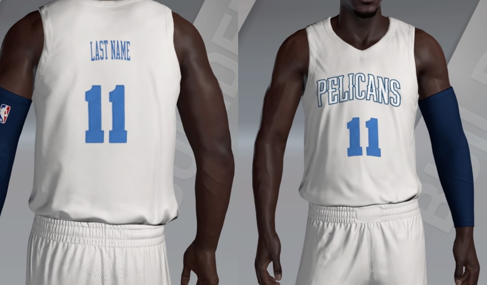
There are four main objects on every uniform within the editor: back number, the front number, the name on the back, and whatever image is placed on the front of the jersey (usually a watermark-like object of some sort). These all appear to exist on different axes, which makes centering all of them rather difficult. In the image below, all four objects are at .50 on the X-axis, which should be directly in the middle. They’re even more off-center when you first open the creator.

Another issue with some of the objects is the size and scale. The default aspect ratio for the numbers on the back of the uniform is .58/.50. For some reason, the aspect ratio on the front of the uniform is .63/.47. Last week, the name on the back was showing your PSN/Xbox username (in lowercase?), and it was incredibly small. Adjusting the size of the name was inaccurate because the actual names on the actual jersey were larger than what was shown in the creator. This has since been fixed and gives me hope that some more of these items can be fixed in the future.
There’s also a weird tilt happening on the left side of the uniform with manual images, which you can see in the picture below. If you put the image on the right side of the uniform, notice how it lines up in proportion to the shoulder stripes. Now, look at how the same image lines up on the left side.

You’ll notice that the axes are not equal parts away from zero. But, visually, the stripe is in the same spot over the cut in the shorts. The stripe on the right is taking into account that the tucked jersey folds in. This creates the illusion that the stripes are misaligned. The stripe on the left is not doing this. This also means the axis is based on the jersey and not the shorts.
Speaking of the shorts, it seems we’ve lost the ability to zoom in when placing images on them. This is something we had last year.
The “simple” fix for all of these would be to have everything in the right place at the start. The .58/.50 ratio looks appropriate for both numbers so make that the default, then put the name at a reasonable size, and, finally, center everything.
Images
One of the things most asked for is more image slots. If you want the Nike/NBA logo on the uniform and/or shorts, that’s 2-4 slots right there. Getting word marks, logos and personally made stripes/patterns gets you to 10, or more.
Another thing that I would find helpful is the ability to copy/flip an image. Right now, the rotation and resizing elements do a good job, but the ability to copy an image with its aspect ratio intact, and flip it horizontally or vertically would be a welcome time-saver. You have to wonder if moving the relocation design elements online could open space for more all-around options.
Fonts
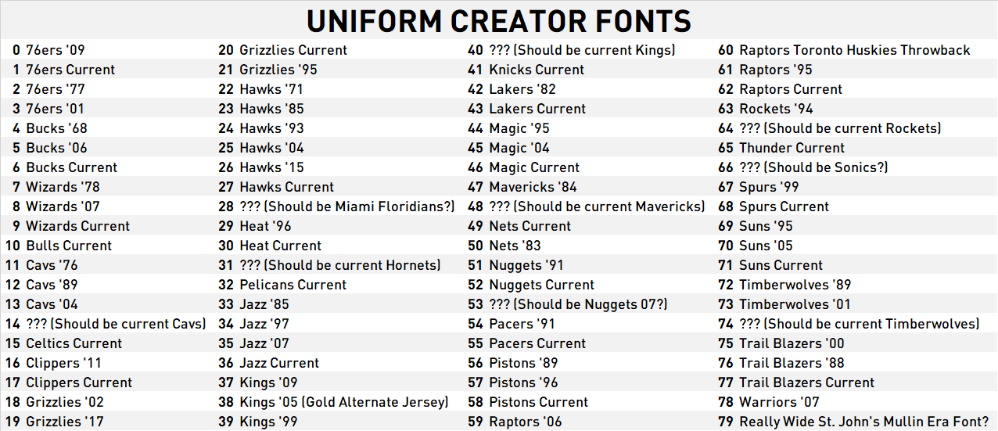
I went through the number fonts in the game and matched them to the real team/uniform to which they correspond. (Please excuse all years shown, as they are just estimates).

The first weird thing that jumps out at me is the question marks. I’ve put in parentheses my best guess as to what should be there. These are mostly newer team fonts, but they all show up as a weird generic block font with no outline. We’re also missing the Warriors’ current font, and the one they used last year.
The second weird thing I notice is the sort order of these fonts. If I didn’t know any better, I would assume the Wizards would be last on the list. But the Wizards are sorted as the Bullets, the Pelicans as the Hornets, and the Thunder as the Sonics.
When working with certain number fonts (Font #73 for example), there are three “layers” to the number: the number itself and two outlines. However, the number and the outside outline are tied together and must be the same color, even though on the real uniform this font is used (the Timberwolves Garnett-era throwback) that is not the case. There are also a few fonts where there are black outlines that are unable to be edited.
The numbers also appear to be of a different material than the rest of the uniform, which makes them shiny, in turn making them much brighter than intended when you use your team colors. It would be great if the game could recognize the selected color as the same color as the final product on the number.
Colors
The color wheel is just decent. Being able to enter RGB values or use an eyedropper tool would be nice. Due to the color issue with the numbers mentioned above, you almost always need more than three colors at your disposal. So, knowing exactly which color to use by having the values available, and not guessing every time with the color wheel, would be easier.
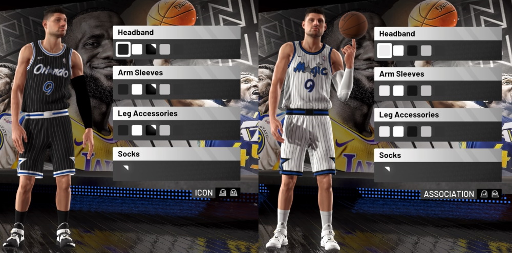
There also seems to be an issue with team colors and accessory colors. The new feature to select accessory colors for each team before the game is great, but it seems random for created uniforms. I know they are tied to colors at a certain position of the jersey (it seems to be some combination of shoulder stripe, jersey color and number color?), but I don’t have access to all my team colors. Look what happens when I re-create the Orlando Magic look from the mid-90s.

Blue accessories are not an option for this uniform. It would be great to be able to select accessory color options for each uniform within the creator.
Layer Options
This year we can put images on top of the waistband area, but not without a drawback. If you’re not happy with the piping/striping options available, you can create your own. However, the stripe now overlaps with the waistband (this looks especially weird if there’s a pattern on the waistband, and it happens every time on the left side of the shorts).
There are also a few options for shoulder stripes that don’t take up the whole shoulder stripe area, which causes side panel striping to abruptly end.
It would be nice if everything on the jersey was opened up for layering purposes — i.e. being able to put a stripe under the waistband but over the shoulder stripes.
Stripes/Piping
There are almost 50 in-game options for piping/striping and a lot of them look familiar. The Suns’ current stripes are present, as are the Bucks, Wizards, Pelicans, Blazers, Jazz, among others. Last year’s design for the Grizzlies’ gray City Edition uniforms was “leaked” in the editor in 2K19. Even some old looks, like the Clippers, Kings and Nuggets designs from earlier this decade are available.
One of the big things I noticed this year versus a few years ago isn’t the number of striping options added, rather it’s the number of striping options taken out. Several simpler options have been removed. This could be a rights thing. I think there was a change in options available after Nike took over. But that still doesn’t explain why the Clippers and Kings designs from 2013 are in there.
It makes sense to have the full Nike jersey template available (the ones with that awful shoulder stripe design) — the shorts are currently included. Though, to not abandon some of the more traditional folks, I would keep the current shoulder designs in there as well. This would mirror the way we can select V-neck, U-neck or wishbone collars.
It would be ideal to have templates available for all the jerseys in the game. I think a solid starting point would be to have every team’s current template present, and some of the more traditional striping patterns added back in as well. NCAA Football’s TeamBuilder did a very good job of getting many in-use templates into the system.
Courts
With fewer traditional court designs and alternate courts becoming more popular, the need for a more robust court editor becomes greater. One of the most requested things is the ability to put your own images on the court, wherever you want, whether that be the center court logo or a logo inside the three-point line like New Orleans does. This would also allow for easier re-creations of the crazy courts of the 1990s, like the ones in Charlotte or Houston.
A stronger court creator would ideally include the ability to put your own designs as the out of bounds area, something like Memphis has, or like the leaked alternate Mavericks court of this season. Being able to add custom word-mark images along the baselines would be a welcome addition.
The creative community within NBA 2K20 is sizable, and they make the game enjoyable for a large number of people. These fixes would go a long way towards making their jobs easier, whether patched/band-aided this year, or fully updated in NBA 2K21. What worries me about fixing some of these now is that it might mess up the current creations already out there, especially via the alignment issues if the axes are reset.
Are there any issues I missed? Should the uniform/court creator be moved online like TeamBuilder? Do you hate sponsorship patches as much as I do? Let me know in the comments!


Published: Oct 4, 2019 03:00 pm