Madden NFL 18
Seven Franchise Mode UI Changes Needed for Madden NFL 18
When playing a franchise mode in any sports game, players often spend much more time navigating menus than on the field playing the actual game. Whether it’s adjusting depth charts, reviewing box scores, catching up on league news, or scouting next year’s crop of draft prospects, the quality of user-interface elements in franchise mode can go a long way in determining how fun — or frustrating — it can be.
Let’s take a look at seven areas where EA can make positive steps towards building a better experience outside of the lines in franchise mode.
1. Franchise Home Screen
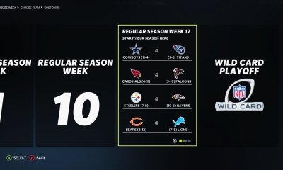
One question you should never have to ask yourself while looking at the home screen in franchise mode is “what week is it?” I mean, look at this. We are informed of the week number in three different ways that take up more than a third of the screen:

The right side of the home screen, which is focused on action items for your team, is actually well done and helps ensure you are taking care of what needs to be addressed from week to week. It’s the left side of this screen that is essentially wasted when it could be delivering information that keeps the user more abreast of what’s going on around the league. It would be nice if that real estate was instead dedicated to more important things, such as division standings, results from key games from the previous week, or a quick scouting report for this week’s opponent.
2. News Page
Perhaps one of the most important tasks for developers in a franchise mode is keeping players connected to everything that is happening around the league. There is a lot going on in the league, including trades, free agent signings, player re-signings, injuries, jockeying for playoff spots and more. How are we to keep tabs on all this activity? Here’s what we are currently provided:

There isn’t much organization and structure here. The screen is littered with random tweets and stories that lack depth or context. It’s somehow both information overload and a dearth of information at the same time. From the example above, only the main story on the left gives any details and a tiny bit of player personality on the news of Logan Ryan’s re-signing with the Pats.
But take Skip Bayless’ tweet regarding Mike McCarthy and the Packers. I’m guessing they are struggling early in the season, but I’m not able to select the tweet to view the NFC North standings, a Packers team page, or any further detail at all. Compare that with NBA 2K17, where both the social media feed on its own is more detailed, and even better, I can select each item and am served up the relevant menu screen with even further information:


EA should implement a similar idea in Madden 18 to help the news page connect us with the league.
3. Standings
You would think the layout of the standings page would be pretty much standard issue: the NFL broken up by conference and division. Everyone is familiar with such a format.
Here’s what the standings page in Madden 17 looks like:

What? Why? We have the entire NFL thrown into one big pot, and somehow a 4-1 Giants team is ranked ahead of a 4-0 Jaguars team. This makes very little sense as the default view. I can understand having a view option that shows the entire NFL ranked 1-32, but not as the main view. I want to be able to see division leaders and playoff races at a glance, and there’s no way to currently do that. Show me all 32 teams on the screen at once, and let me select conference or division views that provide the screen real estate to show detailed statistics like indoor vs. outdoor wins and losses.
4. Player Game Log
Similarly to the standings, the ideal format for a player game log has long been established:

We need the date of the game, the opponent, the result of the game and then all of the relevant individual statistics. It’s all straightforward stuff. Again, Madden 17 has a different idea:

There is no week number or game date, no opponent, no game results. And since the log is automatically sorted by a stat category from largest to smallest (rushing yards in the example above), we can’t determine trends based on progression of the season. By simply adding these items in, the game log screen will once again be interesting and informative to check out.
5. Team Stats
Any coach or coordinator will be able to tell you where their unit ranks in any number of team statistics at the drop of a hat. You hear these rankings dropped all the time in press conferences and interviews: “We’re going up against the third-ranked passing offense this week,” or “we’ve committed the fifth-most penalties in the league, that has to improve,” and so on. The team stats page in Madden 17 makes those rankings a little tougher to determine than need be.

As you can see, we are given a list that we can sort by the various statistical categories, but no numerical ranks. Admittedly, this is a small thing, but something so basic it’s hard to understand why it isn’t provided.
With extra screen width space that is currently unused, it would be nice to see a graph that shows how the highlighted team has ranked in the current category as the season has progressed. That would allow us to see, for example, if our team has been getting better at third-down efficiency over the course of the season, or if we are going the opposite direction.
6. Trade Center
Overall, the trade center is a nice feature in franchise mode that allows players a few different ways to seek out trades that can improve their roster.

There are a few little things that could be added to make this even better. First, give users the ability to add our own players to our trade block from this screen. Currently, the only place to do this (unless I am missing something) is in the Player Card screen.
Secondly, allow the user to select to view all players in the NFL in the “Upgrade Position” screen as is possible from the Trade Block screen. The difference is the Trade Block screen shows players who are being actively shopped by other teams; in the Upgrade Position screen, you must select each team individually to see a list of players by position. It would be nice to be able to scroll through all cornerbacks in the league at once to hone in on the right player.
7. Loading Screens
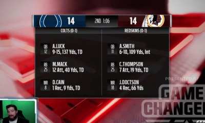
Thankfully we’ve moved past the times when we were shown the same ol’ stuff in every loading screen, whether it was game tips or control hints or just a screen that said “loading.” Now we are shown a few of our players and their weekly, season and milestone goal progress.

While this is helpful for those who are big into racking up XP to develop players, it would be more immersive if you were served with a matchup breakdown, season stats for key players, playoff scenarios or even screenshots from your previous games from the season. These types of things would build an aura of a TV telecast rather than remind you that you are playing a video game, which showing the XP bonuses does.
While UI and menu design do not always get the attention that gameplay, graphics and online modes command, for franchise junkies it is a part of the game they will end up spending a lot of time looking at. Hopefully EA gives the ideas above — and any ideas you provide in the comments — consideration to make a better Madden 18.


