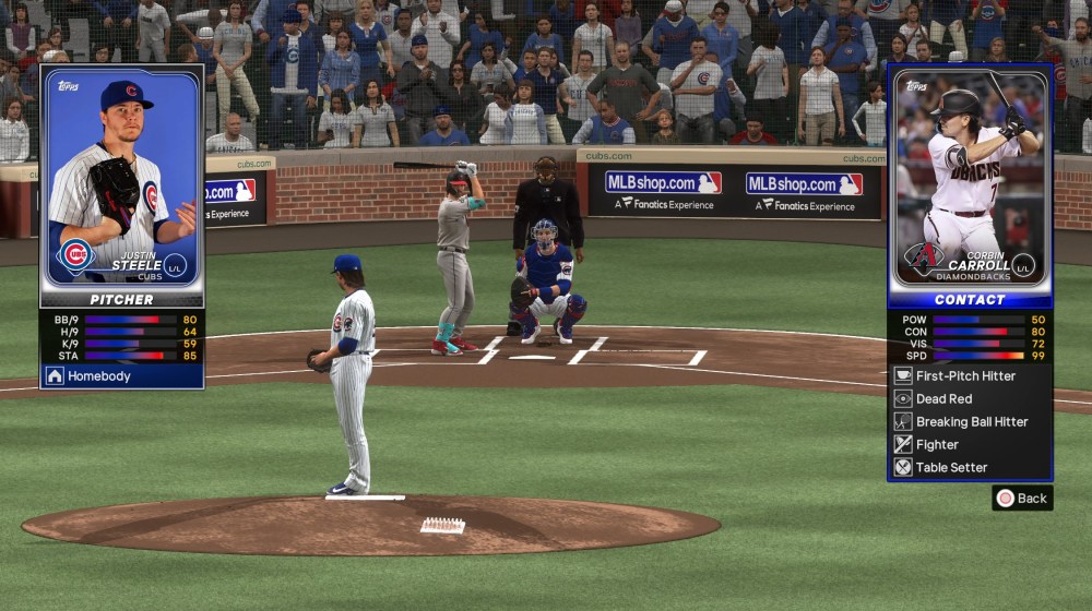
With early access kicking off last night, SDS had a bit of a rough start with some of the usual day one server issues, but that’s mostly been resolved as of this afternoon. The biggest complaint so far from the general internet peanut gallery is actually the searing brightness of the menus and the readability issues of some of the UI.
I would count myself among those who were a bit stunned by how very bright the menus were when I booted up. I’ve seen a couple people say it’s like getting hit with a video game flash bang. I wouldn’t go that far, but the choice to go back to the more old-school white menus from some prior Show games is maybe more than many of us are used to these days with our OLED monitors/televisions and the general preference for “dark mode” on many apps and sites.
As you would assume, it’s more noticeable when you’re playing in a darker room with low lights, but some folks out there are worried about eye strain and even burn-in on their OLEDs. I’m not enough of an expert on what will or will not cause burn in, but the bigger complaint here on OS is more the readability issues at times.

That’s The Show theme above. When playing at night on lower lighting, it’s probably the best way to see how the font choices and font colors cause some issues with reading everything up there. The biggest issue would be the bright white stylistic font for the attributes themselves since the circular visual aids around those numbers don’t pop as much, but the sans serif gray-white font choice is not helping either for some of the other components.
If you swap to the Regional Theme, you get this:

Here we still have the sans serif look, but the background colors provide more contrast for the foreground. In addition, they got rid of that stylish font for the attributes and now have yellow numbers and more colorful visual aids alongside those numbers.
Before MLB The Show 24 launched, I wrote about wanting the MLB Network theme back, but this sort of highlights the trials and tribulations of having multiple in-game themes. Every single one has its own style guide, and it needs to be unique in its own way while still being legible. The readability in this specific menu is not some major issue, but it’s just here to sort of showcase where the problems do pop up overall with this look.
Beyond the in-game UI, some people are already begging for a dark mode and all that. I’m not sure how viable that is since not a ton of games provide multiple menu looks. PlayStation-exclusive game have been on the forefront of accessibility and optionality for a lot of menus and gameplay, so it is in their general wheelhouse, but SDS has not done anything like that in prior games.
If this is a top issue for you, you can submit a feedback request to SDS, but otherwise maybe just have some blue light shades on hand if you’re playing in near darkness.


Published: Mar 15, 2024 04:11 pm